Art as the Unity of Thinking, Seeing and Feeling?
Exploring Sculpture and Architecture Part 2: The Augengefühle (The Eyes’ Emotions) Collection at the Neues Museum Nuremberg.
I am sitting in the train - next to my father, who suddenly decided to accompany me to the museum today. I am very familiar with the route: the trip from my parent’s house in the country to Nuremberg with the Regional Express train takes about 20 minutes. As a teenager it was always an adventure to get into the train with my best friend and go shopping unchaperoned in the big city. Just a hop, skip and a jump away from the main train station, in view of the store where we used to buy plastic sunflowers and Pippi Longstocking posters, is a museum. My interest in contemporary art awoke in the rooms of this sanctuary for art during my school days. Today we are headed straight there - without a stop at the store - to the Neues Museum - State Museum for Art and Design Nuremberg.
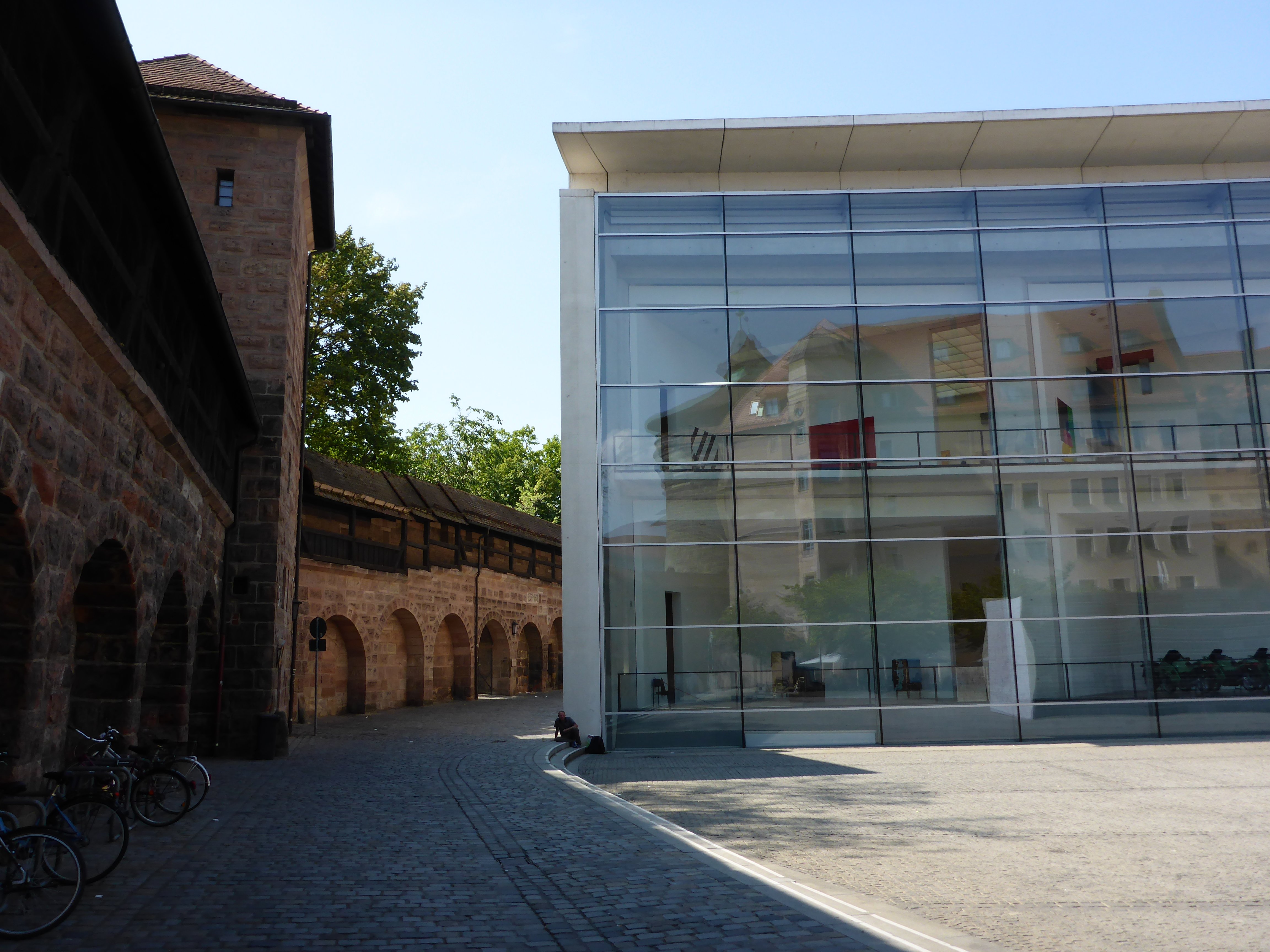
Nuremberg, View from the City Wall.
The architecture was designed by Berlin architect Volker Staab. In 1990 the city of Nuremberg called for the submission of designs for the construction of the museum and ten years later, on April 15, 2000, the building was opened. The most recognizable feature of the building is the impressive, 100 meter long, slightly curved glass facade, which integrates effortlessly with the midieval architecture of the surrounding buildings and the city wall.
From outside it is possible to see into every floor, as well as into the large cement spiral staircase which gives the interior its character. The rooms are spacious and simple, often resembling the ideal White Cube.
The sculptures are part of the Augengefühle (The Eyes’ Emotions) collection. In the text describing the exhibit you can read that the title is a metaphorical expression created by the poet Friederike Mayröcker which describes the unity of thinking, seeing and feeling. The special feature about this exhibit is that the husband and wife architect team of Helmut Schmelzer and Kerstin Hiller bought the pieces displayed here specifically for these rooms of the museum. Thus, it is the ideal collection for the second part of my series Exploring Sculpture and Architecture.
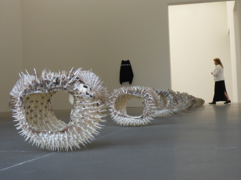
In the exhibit we practically stumble over the first piece, And Babies by the American artist Michael E. Smith. A dozen thorny blowfish, preserved and blown up lie arranged in a row on the floor and point the way into the exhibition room. The fish, with their light-colored spines, appear to float a few centimeters above the dark floor of the museum.
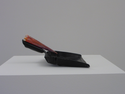
If you take a few steps further in, the other parts of this piece also appear: a dustpan placed on a plinth, the handle of which is completed with a stork’s beak and a black t-shirt hanging on the wall with 6 LED lamps lighting across the chest.
The procession of blowfish, dustpan and sweatshirt are somewhat lost in the large space. But at the same time the everyday objects that have been used are greatly enriched by the sacred atmosphere in the museum rooms. They are almost inflated, just like the blowfish itself. The position of the pieces is right on the line between being too far apart to see the connection and just the right distance in order for the effect to fully develop.
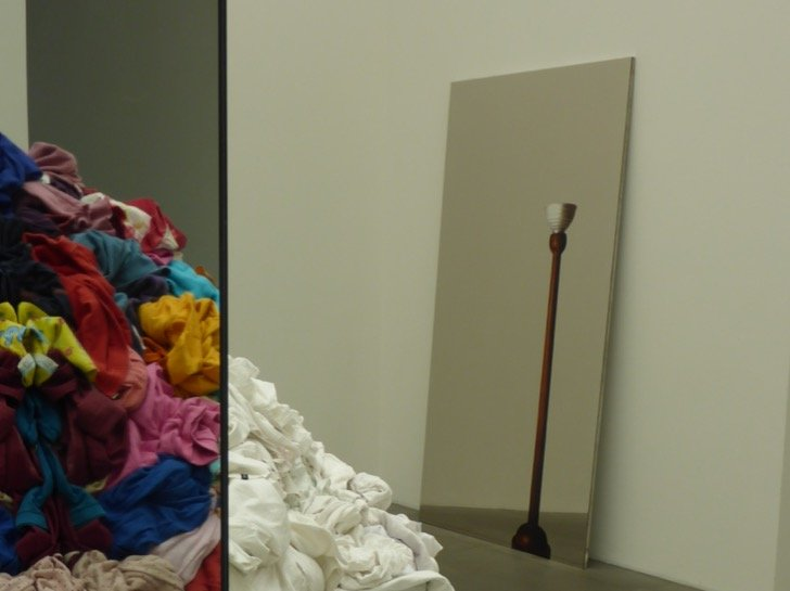
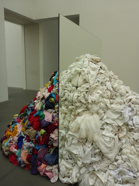
Passing the lit-up shirt, we enter a considerably smaller room where there are two pieces by the Italian artist Michelangelo Pistoletto. In Metamorfosi a mountain of laundry is divided in half by two mirrors - one side is colored and the other one is white. At first glance the pile looks as if the colored side had been washed with a large splash of bleach and mirrored on the other side.
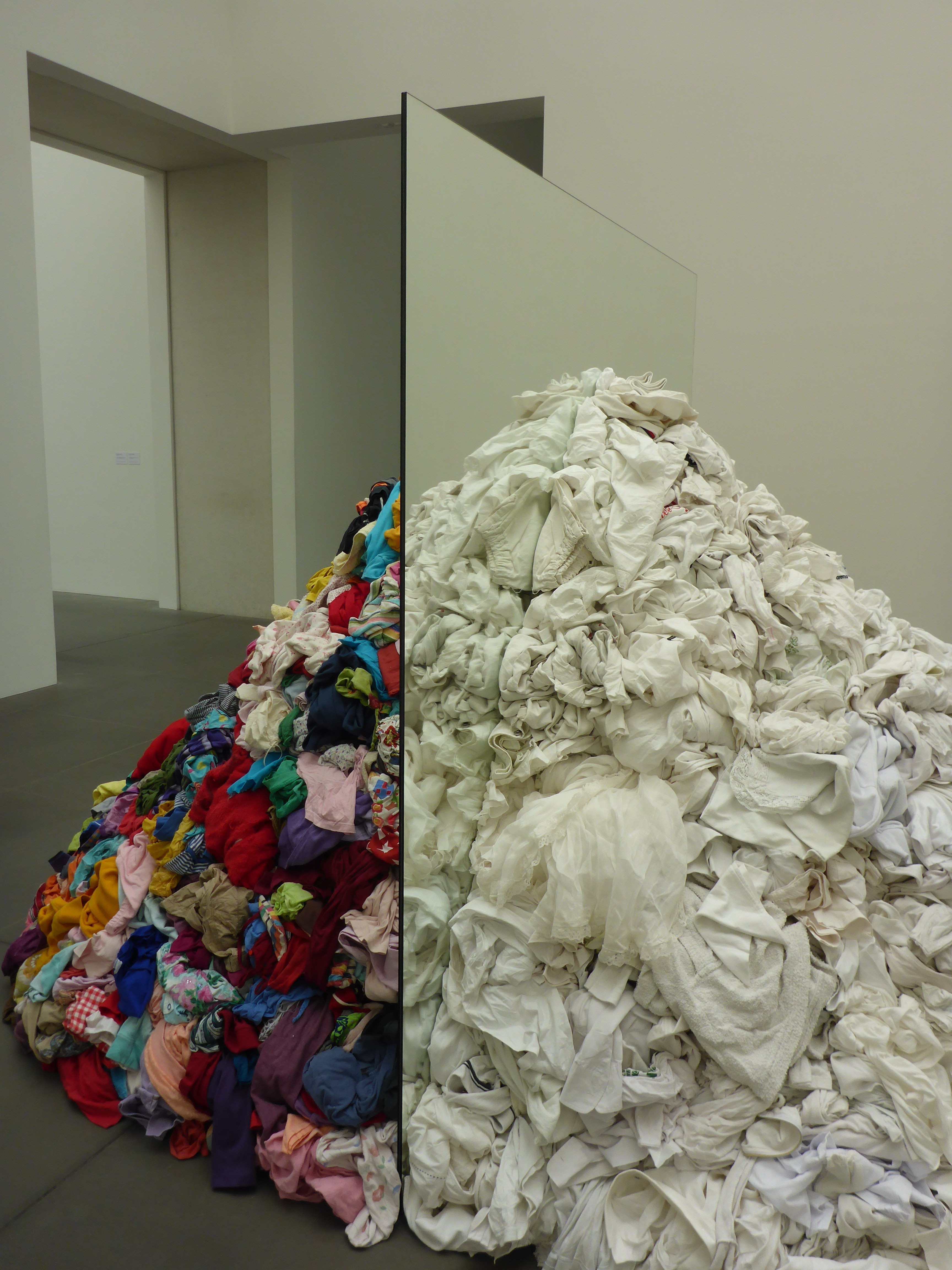
But upon closer examination I recognize the different fabrics and clothes: on the one side light-colored, mostly white textiles, delicate netting, pale yellow sequins, bed sheets embroidered with initials, towels, here and there a softly colored edge or print on white t-shirts. On the opposite side a wildly flowered handkerchief is bundled together with a pink fleece jacket and a leopard print top wrestles with a mint-green robe.
As I walk around the huge pile of clothes my attention moves to the second piece by the Italian artist. Leaning against the wall is a painting about two meters high which shows a lamp and a grey tile floor. Only after a second glance do I realize that the floor lamp was painted on a mirror - or more precisely on a polished steel plate and the floor of the museum is reflected at the bottom of the picture. In both pieces Michelangelo Pistoletto has perfected the game with mirror and reality, room, picture and the observer. The artist says about himself: "If art is the reflection of life, then I am the mirror maker."
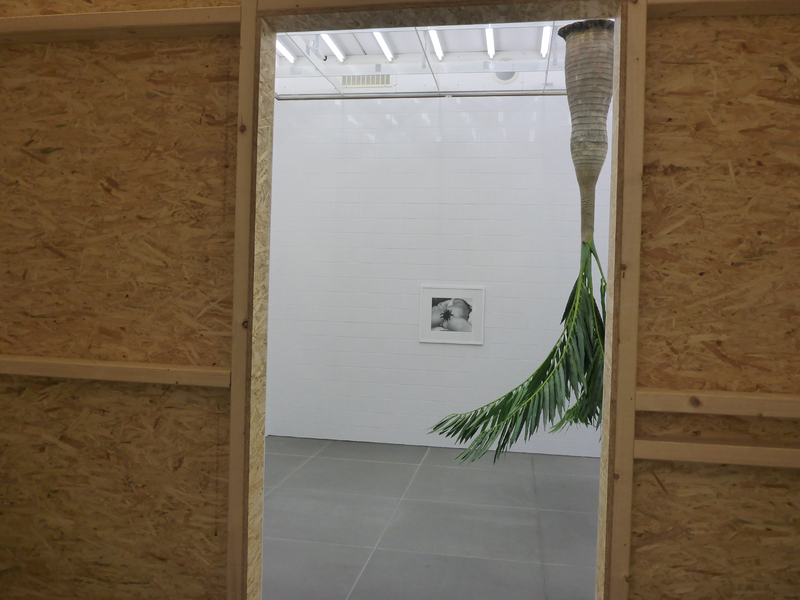
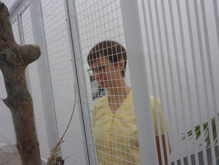
Continuing we enter the room-in-room installation As far as possible by Rosemarie Trockel. For this piece a cube of wood was integrated into the exhibition room in plain sight. On the inside it is completely tiled in white and reminds one of a sterile bathroom. Next to a plastic palm tree hanging upside down from the ceiling there are three pieces by the artist hung on the walls: a bird cage with three stuffed songbirds, a reproduction of Courbet’s The Origin of the World (supplemented by the artist with a tarantula in the woman’s crotch) and a white ceramic bowl which is reminiscent of an over-sized baptismal font. As I near the cage chirping comes from the direction of the birds and, as I observe the animals and their surroundings for a while, one of them begins to move mechanically along a stretch of the tree trunk. I let my gaze sweep through the room, from the three birds to the spider between the woman’s legs, to the palm tree and the glazed ceramic bowl. It is a odd, ambiguous ensemble of pieces in a sterile room.
Art and Space
After a short visit through the other rooms of the collection, my father and I return to the blowfish. We slowly ramble down the spiral staircase towards the exit and talk about the title of the exhibit: Augengefühle (The Eyes’ Emotions). Do the pieces and their deliberate presentation in these rooms actually create the unity of thinking, seeing and feeling described?
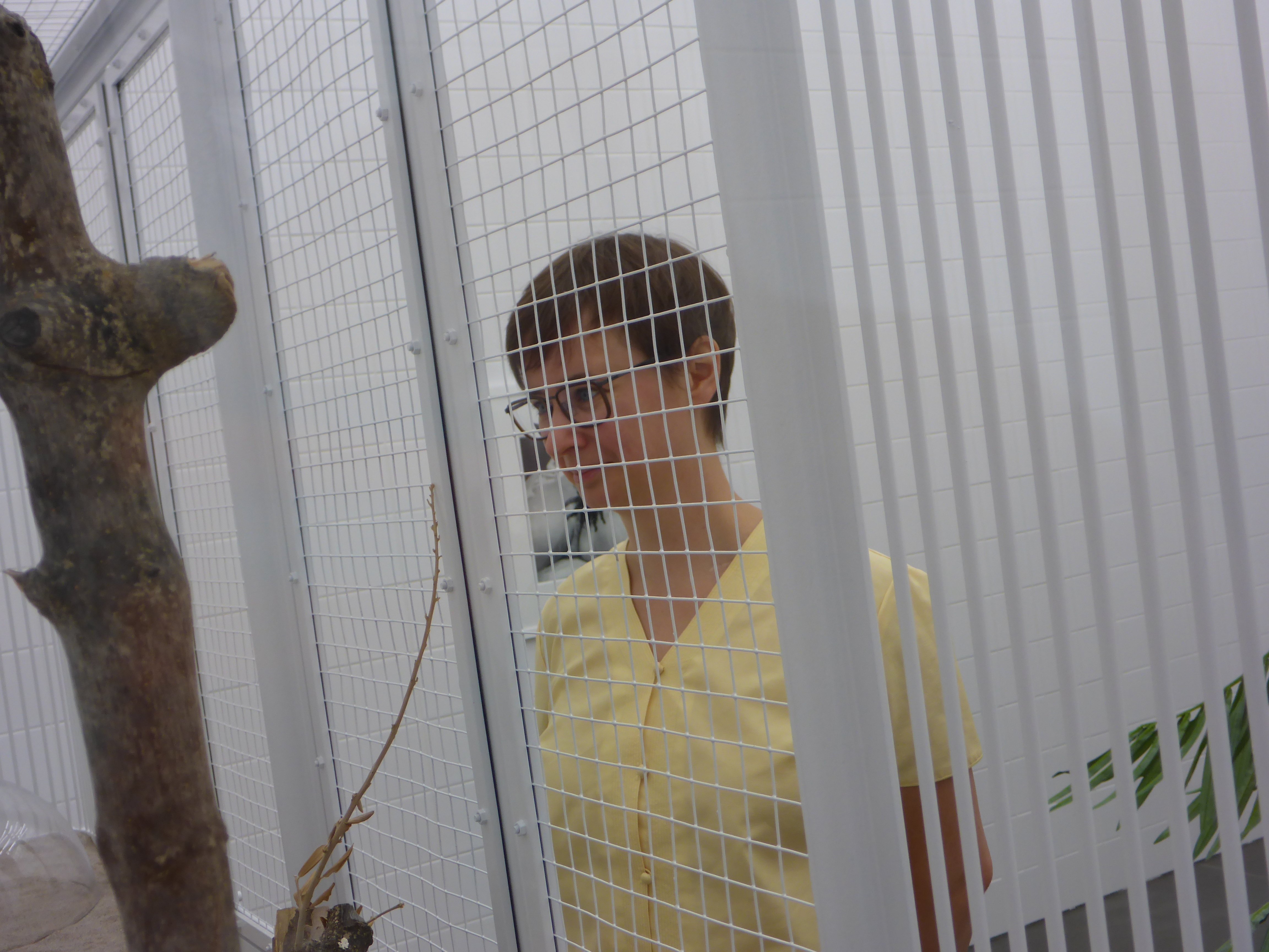
orange-cheeked waxbill and white-rumped schama
in Rosemarie Trockel’s installation
As far as possible. Photo: Georg Pilhofer
We both agree that the pieces are professional and very well staged. The cooperation between the art collecting architect team and the museum was fruitful. However, it is not possible to see that these pieces were purchased for the specific rooms in this particular museum. This does not negatively affect the quality of the exhibit – on the contrary. Perhaps the concept comes to fruition specifically because this is not visible in the foreground. The interplay between the space and the works of art is not forced upon the viewer and lets you think your own thoughts while viewing the pieces and experiencing the feeling of art. That is very much in keeping with the title of the exhibit Augengefühle (The Eyes’ Emotions) and my personal favorite definition of art as a sensually perceptible mental image. (Jean-Christophe-Ammann, Bei näherer Betrachtung: Zeitgenössische Kunst verstehen und deuten (Upon Closer Observation: Understanding and Interpreting Contemporary Art) Piper Verlag München, 2009)
Author: Elisabeth Pilhofer
Elisabeth Pilhofer is a freelance editor and curator based in Munich. This summer she explores places where sculpture meets architecture.
All photos taken by the author if not indicated otherwise.

